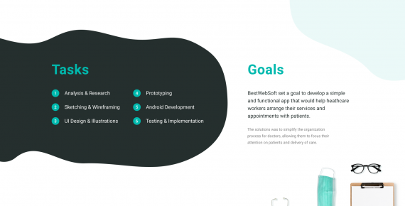
BestWebSoft set a goal to develop a simple and functional mobile app that would help healthcare workers arrange their services and appointments with patients. Our design process includes the following stages:
- Analysis & Research
- Sketching & Wireframing
- UI Design & Illustrations
- Prototyping
Our design choices for the app style are driven by these decisions:
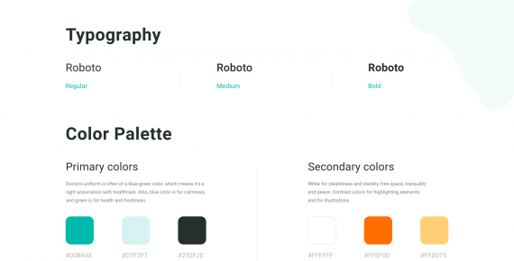
- As primary colors we choose shades of blue-green. Doctors’ uniform is often of a blue-green color, which means it’s a right association with healthcare. Also, blue color is for calmness and green is for health and freshness.
- Our secondary colors are white (for cleanliness and sterility, free space, tranquility and peace) and shades of gray.
- Contrast colors such as orange and yellow-orange are to make an accent.
- Roboto headset as a standard and readable font for Android applications.
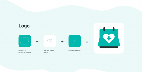
- For the logo we use pictograms of a calendar (for management & planning), a heart (for love and patience) and a cross (for healthcare).
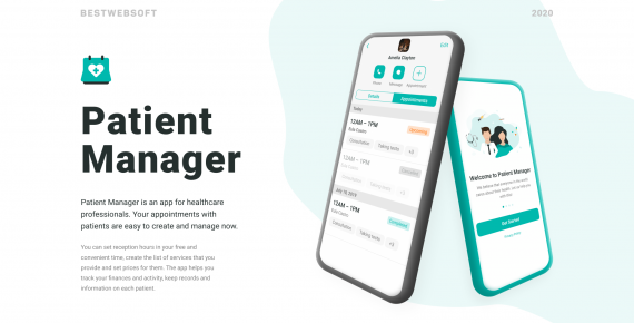
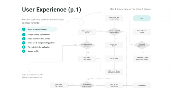
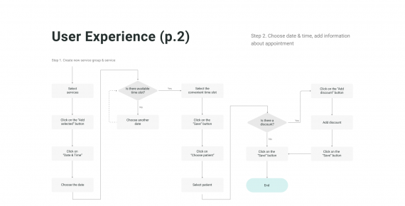
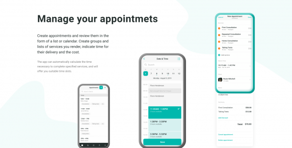
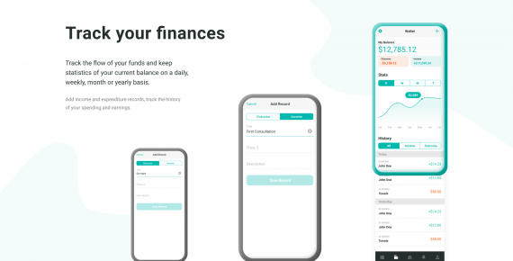
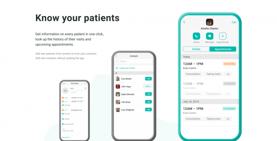
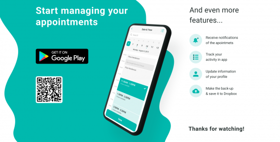
As a result we created a mobile app for healthcare professionals, Patient Manager, where appointments with patients can be easily created and managed. Healthcare professionals can set reception hours in free and convenient time, create the list of services that they provide and set prices for them. The app also helps them to track their finances and activity, keep records and information on each patient. The app is already available in Google Play store and you can check it following this link: https://play.google.com/store/apps/details?id=com.bestwebsoft.patientmanager